Nissan HMI Concept + Design Challenge
Conceptual design developed using Nissan’s original IDS project, and the challenge was provided by HMI San Francisco team. Both pieces leverage motion design to add personality, safer interactions, and seamless storytelling to heads up display(HUD) units. The following, in three parts, includes original imagery (sketches, wires-frames, boards, etc…) detailing key moments in the process and how I got to the final designs.
Role: Art direction, UI/UX/Motion design, Conceptual art
Tools: Cinema 4d / After Effects / Photoshop
Time: 7 days for each one (2 Decks included)
Date: 2018
Pt 1. Concept: “Demon Mode”
Vision of future in-car user experiences, and a demonstration of the users journey visually represented by an emotional, engaging, safer, gamified HUD (Heads up display). Ultimately, the concept HUD would be used as one of the many ways to bring passion and excitement back to the driving experience in a cost-effective way.
The idea is you (1) start the car, (2) get introduced by a pixar-like character and kinetic type, (3) turn on demon mode, (4) press the vehicle gas pedal to accelerate quickly -digital gauges start to shake, turn red, and digitally catch on fire, and (5) when you let off the gas -a new 0-60 time is uploaded to social media automatically.
NOTE: I was not aware nissan challenge would be asking for social elements at the time this was created.

GOAL
Get buy-in from Nissan for my ideas regarding the future of in-car experiences. Re-invent in-car experiences to feel alive, provide seamless storytelling, communicate more effectively, create safer conditions, and complete branding personality.
RESEARCH
(backstory) My history and passion regarding automobiles gives me prior insights into various car communities and the industry. With previous research I was ready with ideas of what the future of in-car user experiences should and will look like. Having a ripe knowledge on the subject helps to complete a project like this quickly with more accuracy. Most of that data collected previously will not be fully detailed in the following.
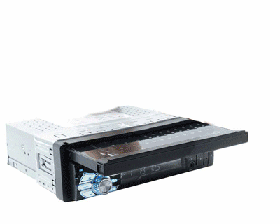
(the space) Image below is the existing IDS design that the Nissan team in SF created. Lucky for me I found this and could use it as a starting point. It’s pretty great stuff -check it out here.

Image taken from Nissan IDS page
(market: today’s & tomorrow’s experiences) Below (left to right), Ford’s EcoMode gamification, Honda’s dual personality modes, auto manufacture’s concepts for future HMI, future UI in Hollywood Sci-fi movies.
Highlighting the vehicle on the left (Ford Focus ST’s ecoMode gamification) -A sports car that gamifies eco-friendly driving habits using visual queues (growing branches and leaves) that track your driving behaviors. After the branches and leaves reach full growth you get a trophy. This simple functionality turns saving MPGs into a game, and it effectively makes driving slow, fun. Moreover, this gives the consumer the perception and satisfaction they purchased a thoughtful product.


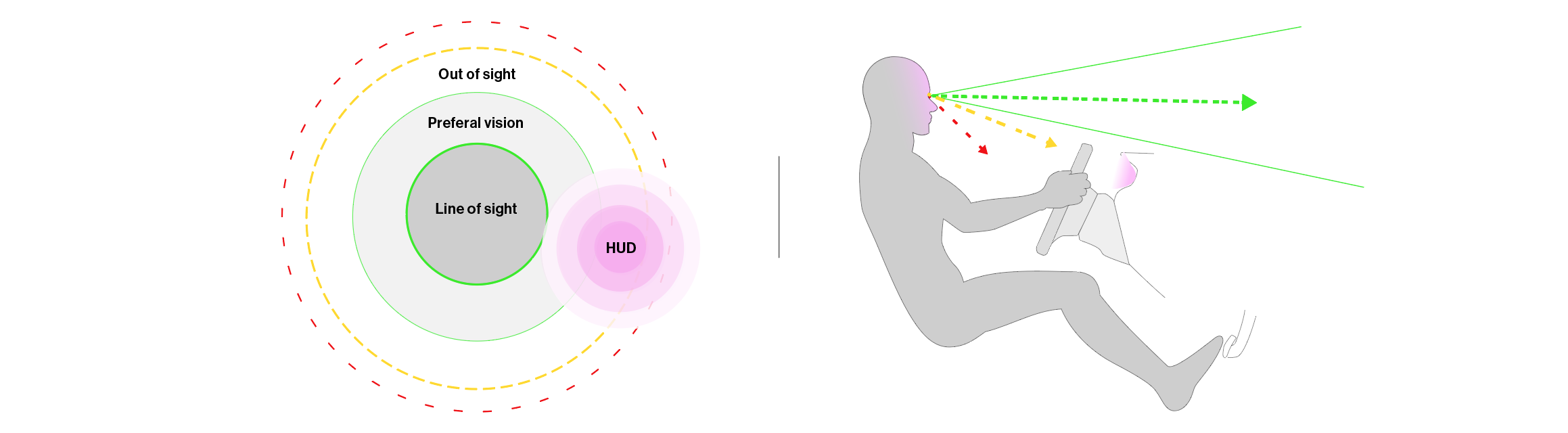
When it comes to more critical aspects of the users experience, like safety, there is a lot of opportunity for improvement. With new technology emerging and consumer vehicles replacing analog HUDs with digital screens there is more reason for exploring and implementing safer design solutions. So far, industry standard HUD designs are failing to demonstrate any appreciation for safer in-car user experiences. Ex. “hands free” becomes “hands and eyes busy with a screen and a phone”. Technical flaws or limitations aside, most interface designs do not have enough visual hierarchy through various design elements to effectively and safely communicate to the user inside or outside direct line-of-sight. Thus requiring the driver to look down away from the road for long periods of time creating hazardous situations.
The following is a simple diagram visualizing the value of good design with respect to safety. In the diagram green dotted line represents the direct line of site, green solid lines are peripheral vision, yellow is out of site, and red isn’t visible. If the driver looks down then the road (green dotted line) becomes yellow and then the line above would be red.
Rally cars are a great example of using visual hierarchy to effectively communicate to the driver. Inside the cockpit they have a bright light near the dash (line-of-sight) that will flash to let the driver know when to shift without looking down at the tachometer. This is usually something you have to purchase aftermarket, and design-wise it is all utilitarian function over beauty.

Image from https://pivotjp.com/product/rcx/rcx-e.html
(user feedback) What people in the car community (reviews, car clubs, channels, businesses, etc..) and regular consumers, who could care less, are saying about todays automotive experiences…
“everything is so passionless”
“I would drive a hybrid if it wasn’t so boring”
“Looks like its from the 90’s”
“Its like a processed piece of cheese or ikea furniture”
“A car is just a car -to get me places”
“Difficult to operate”
(Conclusion) There is a gap in the market regarding relationships between consumers, businesses and their products. This is mostly apparent when looking at in-dash interfaces. Consumers want something that works, is safe, un-intrusive, authentic and inspiring, but current products demonstrate that businesses are not interested. Anyone can see immediately, when entering a modern day vehicle, the in-dash display user experiences are antiquated. They visually look out of place, too busy, lack hierarchy, and often functionally barely work. These poor design choices can result in unsafe driving conditions, frustration, bad relationships, and a negative narratives. There is very little being done to resolve core user experience issues, and any notably compelling car experiences are not fully realized and mostly underwhelming.
There are many reasons the in-dash interface is the key area of opportunity. (1) Predominate part of the driving experience (2) Possibilities for new experiences and designs are limitless (3) Technology is already there waiting to be utilized (4) Potentially high entertainment value (5) Can promote specific driving habits (6) Provides critical information (7) Contributes to safer conditions (8) Completes final product design (9) Inexpensive to improve
HYPOTHESIS
Using relevant and existing technologies, thoughtful visual design, and processes incorporating motion, storytelling, and video-game techniques is a cost effective way to (1) Increase consumer interest in automobiles (2) Demonstrate company values (3) Inspire UX on other platforms. (4) Potentially make for safer driving conditions making the UI easier to visually and mentally digest. Also, designs and concepts should reference and understand historic car culture, and the why, to invent new culture.
DEFINE
In-car digital user experience design that deepens relationships between consumers and businesses by demonstrating interest in and to the consumer. Using the in-dash screens to create never-thought-of thoughtful experiences that introduce new elements of the automobile to be passionate about, change the narrative of “its just a car” into something people love, and create safer conditions.
Words to help guide the design: Social -connectivity to social networking sites. automatically (hands/eyes free) post. Innovate -create something no one has seen in a car Building relationships -the car/computer/UX more as your buddy or lover Inspire -create something that will get others to create something. Emotional -more narrative, experiential, visceral Kinetic Type -animate type with emotion and complete branding Gamification -turn into a game. simulating a video-game Natural Language -natural. playful. friendly. personal.

DESIGN
(Initial thoughts) The tachometer would be a great area to explore creatively as todays HUDs / tachometers are either analog or digital screens mimicking analog. In the digital world, designs and designers are less bound by physical restraints and with current implementation of digital screens we can be more expressive and therefore more effective in communicating. The tachometers etc. can be more engaging, exaggerated, human, and undemanding. Visually, demon mode, should be a combination of arcade style, punk, and pixar. Since it’s a specific “rebellious” mode -design will be somewhat outside their existing design language.
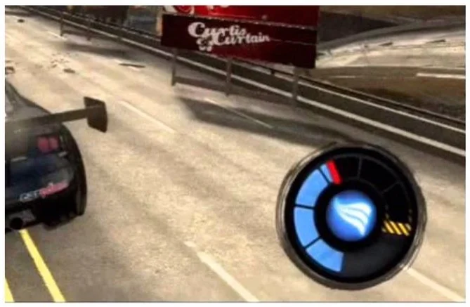
(Inspiration) Driving video-games. Specifically, their use of heat warning / turbo boost bars, usually at edge of the screen, used to communicate to the player their motor is being pushed to the limits. I wanted to take this game element and (1) put it into real physical world car experience (2) push previous designs out in the market by using more motion graphics techniques and (3) make something more useful/functional in the process.


(Brainstorming) Developing initial thoughts into visual form. …When you start pushing the limits of the car, the tachometer world morph into a stylish 3d beating heart or a demon like character with horns and tail. …Text animates to give the ui more life, complete branding personality, and finish design. …Speedometer is more animated -bends as if its trying to keep up when accelerating quickly. …Existing and visually demanding design is simplified by moving widgets that are on the home screen to separate fullscreen “dashboards”. This way you can have a more focused and easier experience.
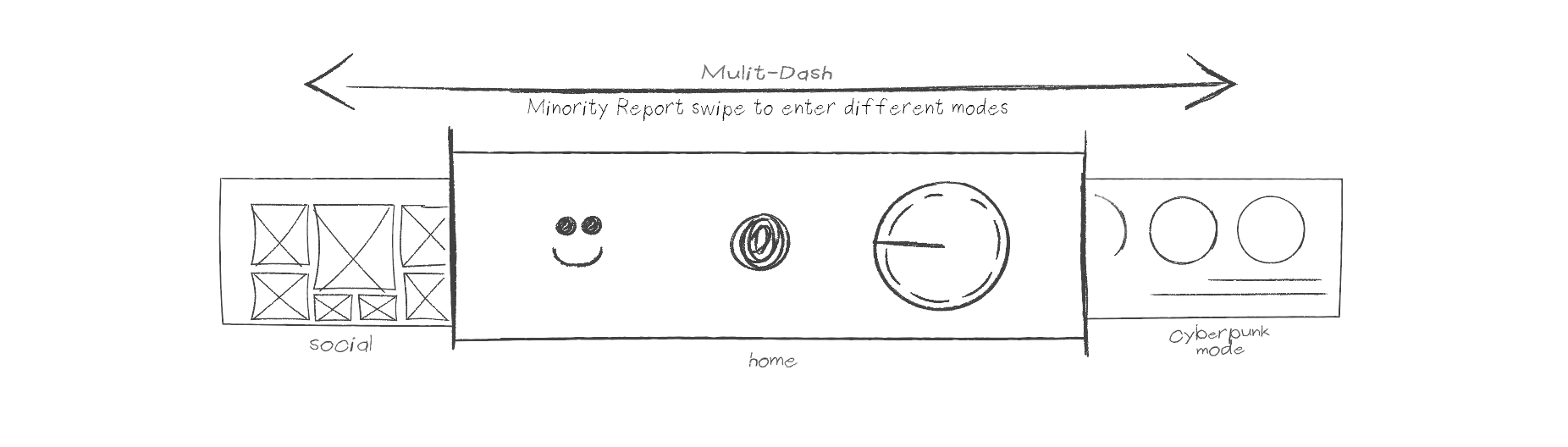
(Wireframe / Flow) A more simplified and uninhibited interface. Home-screen widgets have been moved to separate fullscreen “dashboards” creating a more focused, easier, and therefore safer experience. There are 3-5 fullscreen dashboards available. Home screen includes the voice visualizer, tachometer, and face of the car. Swipe right to enter other mode(cyberpunk mode). From there swipe left twice(past home screen) or swipe right carousel to enter another mode(social mode). Swiping can be done using touch or air gestures. Below is a sketch of the main multi-dash.
Start to finish experience playing in demon mode. After you start the vehicle, go through startup/loading screen, and press the demon mode button. Mostly, everything is automatic and inputs are based off of driving characteristics. The idea is you (1) start the car, (2) get introduced by a pixar-like character and kinetic type, (3) turn on demon mode, (4) press the vehicle gas pedal to accelerate quickly -digital gauges start to shake, turn red, and digitally catch on fire, and (5) when you let off the gas -a new 0-60 time is uploaded to social media automatically. Below is the wireframe of that flow.

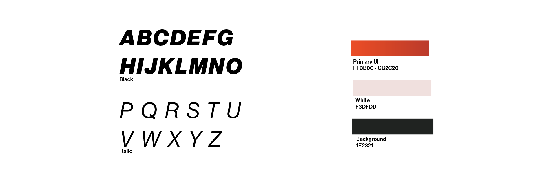
(Color / font) Demon mode section has a different treatment expressing a rebellious tone. The look is a combination of arcade, anime, punk, gothic, and cinematic design influences. The colors change to a hot red gradient over a black background, and the font changes to bold and italic.
Neue Haas Grotesk Display Pro. My go to font for a lot of different looks including the bonus video in the 3 chapter of this page. It’s a clear, quick, balanced, and easy to work with font. In italic, bold it communicates “action” or “speed”, and with the addition of animation it resembles a dark modern anime arcade style. Hero text treatment: (1) bold italic for top line (2) italic for the bottom (3) all caps (4) add extra letter spacing for thinner type. Font for “good morning” introduction character animation is the same Nissan used in original design.
Red and black, nothing says hot, fire, speed, heart pumping passion more. Having the UI all red will alone completely change the driver perception on an emotional level. Red speaks to the devilish / naughty nature of driving quick and fast in demon mode. Additionally, red is better for nighttime driving because it doesn’t contract the pupil. Thus allowing you to still see in the dark without waiting for your eyes to adjust. This provides the driver with higher visibility at night making it safer. Also, an all red themed UI is good reference to older sporty cars interior design.
(Iteration) Restyling Nissan’s original character for a less friendly demon mode design theme. Visually, the character should look devious, aggressive, and cool. Color turns red and eyes steam, cell shaded / modern look. Below are some rapid high level ideas.

MOTION
Use motion to (1) create personality, (2) communicate effectively, and (3) tell a better story. Complement rebellious demon UI visual treatment with animations that will express the same tone. That means motion will move in a way that conveys a devious attitude. Learn what makes animation look devious by referencing old cartoons with a devious characters and exploring related words.
(Principles) (1) Expressive - Exaggerated and emotional animation characteristics resembling a rude tude and punk vibes (2) Focus and informative - Move design elements to create hierarchy and relevance (3) Seamless -Transitions and shared elements across transitions

Expressive

Focus
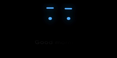
(Inspiration) vs execution for start-up animated “good morning” text. Making the text look like its waking up and doing a morning stretch. An iconic stretch move where one hand goes up before the other one. This is a toned down, less cartoony, and a more modern / minimalist approach to a Ben and Jerry animation.

AUDIO
Audio is probably the most key component of making the entire experience successful and usually the most under-appreciated. Sound should be visceral, crisp, and clean. Demon mode has realistic small V8 engine sounds and various arcade-like sounds.When you press down on the accelerator the engine sounds will play though speakers. Even though its fake -its fun -and acceptable if done right. Note: A sound engineer to create sound engine using synths etc. will probably be needed.
RESULTS
Feedback has been nothing but positive. The presented visual prototype received buy-in from Nissan.
Afterward, small scale testing of all 3 parts including the “2.challenge” and “3.bonus”. During testing some explanation was necessary like -”this is what you car hud could look like”, “it will be an interactive experience where the visuals and sounds react to your driving”, “and it’s a new driving mode called demon mode. 100% of the audience emotional response is excitement and positive. Below, are some quotes of those responses.
“Oh, that awesome -you did that!?”
“People like it because it’s good and unique.”
“That’s cool!”
“Can I see that again!?”
Pt 2. The Challenge
Direction is verbatim copy and paste ((( NISSAN opening animation, 3480 x 704 pixel, Design background, Create all icons designs, Full map expansion -Map becomes full screen and VPA and Media minimized, HVAC control -Open HVAC widjet and change temp., Yelp -Yelp page open and reserve a place to eat, NISSAN closing animation “See you! David!”, Opening to main Home screen -> Map expansion -> HVAC + YELP pop up -> Closing ))) Final is below.
-Due in a week
-Assets (PDF with a few rough & low resolution images)
CREATING ASSETS
Below is the screenshot (low resolution / flat image) I received inside the PDF. It details the HUDs introduction screen that is launched when the vehicle is turned on.

-Wireframe (Included in original PDF)
I needed to animate the introduction, and in order do so would need assets to animate/manipulate. I created a 3D version of the logo, lit it, put in AE with Alpha, made the background using noise, blurs, gradients, and animated I lighter texture to give wormhole effect. Below are images inside C4D and AE, and a render of the logo with alpha.

Cinema 4d

After Effects
DESIGN
For this challenge the treatment is different from the Demon Mode above. Style is more modern / elegant and reflects the provided desired design. The goal is to take the mockup and overall improve the style (layout, font, and color), animate the introduction using single image, include HUD elements (mpg, drive modes, distance, GPS, voice visual), specific apps (Netflix, social element), and demonstrate making reservations.

-Wireframe (Included in original PDF)
(initial thoughts) Create a more seamless unified look. Use larger and spread out buttons for ease-of-use and safety. Make it futuristic, but familiar. Tighten things up. Use nice and elegant colors and modern font, less busy. Since the core of the design already exists the real opportunity would be to compliment it with great interaction and motion.
INTERACTION
Keep the interface simple and safe with motion sensing and layered UX design. Think, hover state. Hide items until user is ready and interacts with them or until the item is relevant. Do this by lifting a hand or saying keywords to begin interacting. When hand goes up, the UI animates in from off-screen at the same time and ready to be pressed. Volkswagen does this using an infrared proximity sensor for their infotainment system. It’s a great way to keep things minimal, clean and focused to able the driver to comprehend things quickly and concentrate on what matters. This will also make the product feel more refined and interesting. Below, Illustration on the left showing the layers and physical interaction, and graphic on the right showing seamless flow and storytelling.

MOTION
(Principles) Several words and examples to help guide the final design. Focus - Move design elements to create hierarchy, relevance, and space. Use to keep things simple and hide things Informative - move elements to notify user something needs their attentions. Elegant, animation should be smooth sophisticated and seamless. Quick don’t get in the way but don’t be jerky either. Ease (90% influence in and out).
focus

informative
(Inspiration) vs execution for pop up window / menu. Making the the page look like a retro hidden pop-out display. I thought this would be a good reference for animation, give dimension, and falls into car culture.